Landing Page Optimization: How to Turn Ad Clicks Into Conversions
A data-driven guide to designing and optimizing landing pages that maximize your PPC campaign performance.

Every dollar you spend on PPC advertising is wasted if the page your visitors land on fails to convert them. A well-optimized landing page can double or triple your conversion rate without increasing your ad spend by a single cent. That means more leads, more sales, and a dramatically better return on every click you pay for. This guide covers the principles, tactics, and testing methods that turn landing pages from traffic dead ends into conversion engines.
Why landing pages matter for PPC
When someone clicks your ad, they arrive on your website with a specific expectation shaped by the ad they just saw. If your landing page does not immediately match that expectation, they leave. The average bounce rate on PPC landing pages across industries is between 60% and 70%, which means most businesses lose the majority of their paid traffic before it has a chance to convert.
The gap between a mediocre landing page and an optimized one is not marginal. Across industries, the top 25% of landing pages convert at 5.3% or higher, while the median conversion rate sits around 2.3%. The top 10% convert at over 11%. The difference between a 2% conversion rate and a 6% conversion rate on the same ad spend means three times as many customers for the same budget.
Landing page optimization is the highest-leverage activity in PPC management. Improving your Quality Score through better landing page experience also lowers your cost per click on Google Ads, creating a compounding benefit: you pay less per click and convert more of those clicks into customers.
Anatomy of a high-converting landing page
High-converting landing pages share a consistent set of structural elements. Every element serves a purpose, and removing distractions is as important as adding persuasive content.
Above the fold
The top section of your landing page — what visitors see before scrolling — determines whether they stay or leave. You have roughly five seconds to communicate three things: what you offer, why it matters to them, and what they should do next.
Headline: Your headline must match the ad that brought the visitor here. If your ad promises "Free Consultation for Small Business Tax Filing," your landing page headline should reinforce that exact offer. Mismatched messaging is the number one conversion killer.
Subheadline: Expand on the headline with a specific benefit or proof point. "Trusted by over 2,000 small businesses" or "Average client saves $4,500 per year" adds credibility immediately.
Hero image or video: Use a visual that reinforces your value proposition. For service businesses, this could be a team photo or a short video introduction. For e-commerce, show the product in use. Avoid generic stock photography — it signals inauthenticity.
Primary call to action: Your main CTA button should be visible above the fold without scrolling. Use action-oriented text: "Get My Free Quote," "Start My Trial," "Book My Consultation." Avoid vague labels like "Submit" or "Learn More."
The body: building the case
Below the fold, your landing page builds the argument for why the visitor should take action.
Benefits over features: Lead with what the customer gains, not what your product does. "Save 10 hours per week on bookkeeping" is more compelling than "Cloud-based accounting software with automated reconciliation." Connect every feature to a tangible outcome the visitor cares about.
Social proof: Include testimonials, case study excerpts, client logos, review ratings, or specific results. Third-party validation is more persuasive than anything you say about yourself. Place social proof strategically throughout the page, not just in a single testimonial section at the bottom.
Trust indicators: Security badges, industry certifications, money-back guarantees, and privacy assurances reduce the perceived risk of taking action. These are especially important on pages where visitors need to enter personal information or make a purchase.
Objection handling: Anticipate the reasons someone might hesitate and address them directly. If your service requires a contract, state "No long-term commitments" prominently. If pricing is a concern, include "Flexible payment plans available." Remove friction before it becomes a reason to leave.
The form or conversion element
Your form or conversion mechanism is where the page either succeeds or fails. Every additional form field reduces your conversion rate. Only ask for information you genuinely need to take the next step.
Lead generation pages: Name, email, and phone number are typically sufficient for an initial inquiry. Every field beyond those three should be justified by a clear business need. If you need more information to qualify leads, collect it in a follow-up call or email rather than on the form itself.
E-commerce pages: Simplify the checkout flow. Enable guest checkout, support auto-fill, and minimize the number of steps between "Add to Cart" and "Order Confirmed."
Multi-step forms: For complex services that require detailed information, break the form into multiple steps with a progress indicator. Multi-step forms consistently outperform long single-page forms because they reduce the psychological burden of filling out many fields at once. The first step should ask for the easiest information to create commitment.
Headline formulas that convert
Your headline is the most important piece of copy on the page. These proven headline structures consistently outperform generic alternatives.
The direct benefit headline
State the primary benefit the visitor will receive. "Get More Qualified Leads Without Increasing Your Ad Spend." This works when the benefit is clear and compelling enough to stand on its own.
The problem-solution headline
Name the problem your visitor faces, then present your solution. "Tired of Wasting Money on Ads That Do Not Convert? Our Landing Pages Fix That." This resonates when visitors are frustrated with a specific pain point.
The specificity headline
Use specific numbers and outcomes. "Join 1,847 Businesses That Increased Conversions by 127% in 90 Days." Specificity signals credibility because vague claims are easy to make while precise numbers suggest real data.
The question headline
Ask a question your visitor is already asking themselves. "What If You Could Double Your Leads Without Spending More on Ads?" Questions engage the reader by inviting them to answer mentally, which increases attention and time on page.
Social proof that drives action
Not all social proof is equal. The most effective social proof is specific, relevant, and verifiable.
Testimonials with measurable results: "We increased our monthly leads from 12 to 47 within three months" is far more persuasive than "Great service, highly recommend." Ask customers for specific outcomes and use those numbers in your testimonials.
Industry-specific testimonials: A visitor from the healthcare industry trusts a testimonial from another healthcare business more than a generic one. If you serve multiple industries, consider using dynamic social proof that shows relevant testimonials based on the visitor's referral source or segment.
Volume indicators: "Trusted by 5,000+ businesses" or "Over 1 million projects completed" provides reassurance through scale. If you are a smaller business, focus on specific results rather than volume.
Review aggregation: Display your Google Reviews rating, Trustpilot score, or industry-specific review platform rating with a link to the source. Third-party review platforms carry more credibility than self-published testimonials because visitors know you cannot edit them.
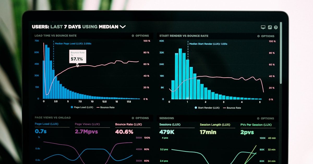
Page speed and technical performance
Page speed directly impacts conversion rates and Quality Score. Research consistently shows that conversion rates drop by an average of 4.4% for every additional second of load time. A landing page that loads in one second converts at nearly three times the rate of one that loads in five seconds.
Speed optimization checklist
- Compress all images to appropriate file sizes. Use modern formats like WebP. Images are the most common cause of slow landing pages.
- Minimize HTTP requests by reducing the number of scripts, stylesheets, and external resources your page loads.
- Enable browser caching so returning visitors load the page faster.
- Use a content delivery network (CDN) to serve your page from a server geographically close to your visitor.
- Eliminate render-blocking resources that prevent the browser from displaying your page until they finish loading.
- Aim for a Core Web Vitals score of "Good" in Google's PageSpeed Insights tool. This means a Largest Contentful Paint under 2.5 seconds, a Cumulative Layout Shift below 0.1, and an Interaction to Next Paint under 200 milliseconds.
Mobile optimization
More than 60% of PPC clicks happen on mobile devices. A landing page that looks great on desktop but is frustrating on a phone wastes the majority of your ad spend.
Thumb-friendly design: Place your CTA button where the thumb naturally rests. Ensure tap targets are large enough (at least 44x44 pixels) and spaced far enough apart to prevent accidental taps.
Readable without zooming: Use a minimum font size of 16 pixels for body text. Ensure your headline, subheadline, and CTA are readable without pinching or zooming.
Fast mobile load times: Mobile connections are often slower than desktop. Optimize images aggressively and defer non-critical resources.
Click-to-call: For service businesses, make your phone number a tap-to-call link. On mobile, calling is often easier than filling out a form, and phone leads tend to convert at higher rates.
Simplified forms: Consider reducing form fields on mobile or using auto-fill-friendly input types (email, phone, name) that leverage the device's keyboard and autofill capabilities.
A/B testing methodology
Optimization is not a one-time event. Continuous testing is what separates landing pages that perform well from landing pages that perform at their best.
What to test
Prioritize tests that have the highest potential impact on conversion rates.
- Headlines: The single highest-impact element. Test different value propositions, specificity levels, and emotional tones.
- CTA button text and color: Test action-oriented text variations. "Get My Free Quote" versus "Request a Quote" versus "See Pricing." Test contrasting button colors that stand out against your page design.
- Form length: Test removing one or two fields and measure the impact on both conversion rate and lead quality.
- Social proof placement: Test placing testimonials above the fold versus below, or near the CTA versus in a separate section.
- Page length: Test a shorter, more concise page against a longer, more detailed page. The winner varies by industry and audience.
Testing rules
Test one variable at a time. If you change the headline, CTA, and image simultaneously, you cannot determine which change caused the difference in performance.
Run tests to statistical significance. Most A/B tests need at least 100 conversions per variation to produce reliable results. Calling a test too early leads to decisions based on random noise rather than real performance differences.
Document every test. Record what you tested, the hypothesis behind it, the results, and what you learned. This creates an institutional knowledge base that makes every future test smarter.
Set a testing calendar. Run one test every two to four weeks. Consistent testing compounds over time — a 5% improvement each month results in an 80% improvement over a year.
Common landing page mistakes
Navigation menus and external links. A landing page should have one goal and one path to achieve it. Navigation menus, footer links, and sidebar content give visitors escape routes. Remove everything that does not directly support the conversion goal.
Mismatched messaging. If your ad says "50% Off First Month" and your landing page does not mention the discount prominently, visitors feel misled. Message match between ad and landing page is non-negotiable.
Asking for too much information. Every form field adds friction. If your form asks for company size, annual revenue, job title, and a detailed description of the project, most visitors will abandon it. Collect the minimum information needed to start a conversation.
No clear visual hierarchy. Visitors should be able to scan your page and understand the offer within seconds. Use size, color, and spacing to guide the eye from headline to value proposition to CTA. If everything on the page looks equally important, nothing stands out.
Slow load times. A page that takes more than three seconds to load loses nearly half its visitors before they see a single word of your carefully crafted copy. Speed is not optional.
Tools for landing page building and testing
Unbounce: Drag-and-drop landing page builder with built-in A/B testing and dynamic text replacement that matches your page headline to the visitor's search query.
Instapage: Enterprise-grade landing page platform with heatmaps, analytics, and advanced personalization features.
Google Optimize (successor tools): Free A/B testing that integrates directly with Google Ads and Google Analytics for seamless performance tracking.
Hotjar: Heatmaps and session recordings that show exactly how visitors interact with your page — where they click, how far they scroll, and where they drop off.
Google PageSpeed Insights: Free tool that analyzes your page speed and provides specific recommendations for improvement.
Key takeaways
- Landing page optimization is the highest-leverage activity in PPC. Doubling your conversion rate has the same effect as doubling your ad budget but costs nothing extra.
- Match your landing page headline and messaging directly to the ad that brings visitors there. Mismatched messaging is the most common reason for high bounce rates.
- Include social proof with specific, measurable results throughout the page. Generic testimonials carry little weight.
- Minimize form fields to only what you need for the next step. Every additional field reduces conversions.
- Optimize for mobile first — the majority of PPC clicks happen on phones. Ensure fast load times, thumb-friendly buttons, and readable text.
- A/B test one element at a time, run tests to statistical significance, and maintain a consistent testing calendar. Small improvements compound into dramatic results.
- Page speed is a conversion factor and a Quality Score factor. Invest in technical optimization to improve both performance and ad costs.
More PPC Advertising resources
View all resources
Google Ads vs. Facebook Ads: Which Platform Is Right for Your Business?
An honest comparison of Google Ads and Facebook Ads covering costs, targeting, use cases, and how to decide where to invest your budget.
PPC Budget Guide: How Much Should Your Toronto Business Spend?
Data-driven PPC budget guide for Toronto small businesses. Industry benchmarks, budget calculators, seasonal adjustments, and ROI expectations.

Google Ads for Toronto Home Services: PPC That Pays for Itself
How Toronto home service businesses use Google Ads to generate leads profitably. Local Services Ads, seasonal strategies, budget tips, and call tracking.
Grow your business with PPC Advertising
Ready to put these ppc advertising strategies into action? Let Fieldgates handle it for you.