5 Signs Your Website Is Costing You Customers
Is your website driving visitors away? Here are five warning signs and what to do about them to improve conversions.

Your website might be your hardest-working employee or your most expensive liability. The difference often comes down to details that most business owners overlook. You are spending money on SEO, PPC, social media, and email marketing to drive people to your site. But if your website is not converting those visitors into leads and customers, you are pouring water into a leaky bucket.
The frustrating part is that the signs are usually hiding in plain sight. Here are five warning signals that your website is costing you customers, and what to do about each one.
1. Your site takes more than three seconds to load
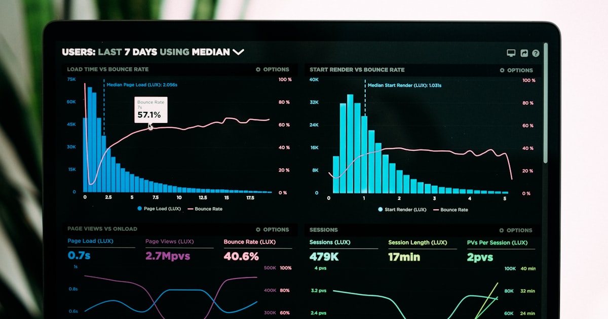
This is the most straightforward problem on the list, and also the most damaging. Research consistently shows that every additional second of load time increases bounce rates dramatically. If your website takes four or five seconds to load, you are losing nearly half your visitors before they ever see your content.
And it is not just about user patience. Page speed is a direct ranking factor for Google. Slow sites get pushed down in search results, which means you are paying twice: losing the visitors who do arrive and losing the ones who never find you in the first place.
What is causing it? The most common culprits are unoptimized images (large file sizes that have not been compressed), too many plugins or scripts loading on every page, cheap or poorly configured hosting, and bloated themes or page builders that add unnecessary code.
What to do about it. Start by testing your site speed with Google's PageSpeed Insights. It will give you a score and specific recommendations. The quick wins are usually image compression, enabling browser caching, and removing unused plugins. For deeper issues like poor hosting or a bloated codebase, you are likely looking at a more involved web design project to rebuild on a faster, cleaner foundation.
Do not treat this as a minor issue. Speed is the first impression your website makes, and you do not get a second chance at it.
2. Your mobile experience is an afterthought
Over 60 percent of web traffic in Canada now comes from mobile devices. If your website was designed primarily for desktop and simply scales down on smaller screens, your mobile visitors are having a subpar experience. And they know it.
Common mobile problems include text that is too small to read without zooming, buttons that are too close together to tap accurately, horizontal scrolling required to see full content, pop-ups that are difficult or impossible to close on a small screen, and forms that are painful to fill out on a phone.
Why it matters beyond usability. Google uses mobile-first indexing, which means it primarily uses the mobile version of your site for ranking and indexing. If your mobile experience is poor, your search rankings suffer across all devices, not just mobile.
What to do about it. Pull out your phone right now and go through your website as if you were a potential customer. Try to find information. Try to fill out your contact form. Try to read a full page of content. If anything feels awkward, slow, or frustrating, your visitors feel the same way.
True mobile optimization is not just about responsive design. It is about rethinking the user experience for a smaller screen: simplifying navigation, prioritizing the most important content, ensuring touch targets are appropriately sized, and making sure your calls to action are prominent and easy to interact with.
3. Visitors cannot figure out what you do in five seconds
This is the test that most small business websites fail. A new visitor lands on your homepage and within five seconds, they should be able to answer three questions: What does this company do? Is it relevant to me? What should I do next?
If your homepage leads with a vague tagline like "Innovative Solutions for Modern Businesses" or a full-screen image slider that takes ten seconds to cycle through before revealing anything useful, you are losing people before they even start scrolling.
Why this happens. Business owners are often too close to their own brand. They assume visitors have context they do not. They prioritize what the business wants to say over what the visitor needs to hear. Or they get caught up in making the site look impressive at the expense of making it clear.
What to do about it. Your homepage should have a clear headline that states what you do and who you do it for. Not a clever slogan. A plain statement that a stranger could understand instantly. Below that, a brief supporting statement that explains the value you provide. And immediately visible, a clear call to action: "Get a Free Quote," "Book a Consultation," "See Our Services."
Show your website to someone who knows nothing about your business. Give them five seconds. Then ask them what the company does. If they cannot answer accurately, your messaging needs work.
4. You have no clear calls to action
A visitor reads your services page, nods along, thinks "this company seems good." Then what? If there is no obvious next step, no button, no form, no prompt, they leave. And they probably do not come back.
This is one of the most common conversion killers we see, especially on small business websites that were designed by developers focused on aesthetics rather than strategy. The site looks beautiful but does not guide visitors toward a specific action.
Where CTAs need to be. Every page on your site should have at least one clear call to action. Your homepage needs one above the fold. Your service pages should each have a CTA relevant to that service. Your blog posts should end with a next step. Even your About page should direct visitors toward contacting you.
What makes a CTA effective. Specificity matters. "Submit" is weak. "Get Your Free Quote" is better. "Book a 15-Minute Strategy Call" is better still. The more specific and low-commitment the action feels, the more likely someone is to take it.
Placement matters too. Do not bury your CTA at the bottom of a long page. Include it at multiple points: near the top, in the middle after you have built some credibility, and at the end as a final prompt.
What to do about it. Audit every page on your website and ask: "What do I want the visitor to do after reading this?" If the answer is not immediately obvious on the page itself, you have a problem. Map out the ideal visitor journey from landing page to conversion, and make sure your CTAs guide people along that path.
5. Your content is outdated or generic
If your blog's most recent post is from 2023, or your service descriptions read like they were copied from a template, visitors notice. Outdated content signals one of two things to a potential customer: either this business is not active, or it does not care about its online presence. Neither is a message you want to send.
Generic content is equally damaging. If your website could belong to any business in your industry just by swapping out the logo, it is not doing its job. Your content should reflect your specific expertise, your approach, your market, and the actual problems your customers face.
Why fresh content matters for more than just appearances. Google favours websites that are regularly updated with relevant, high-quality content. A consistent publishing schedule signals that your site is active and authoritative. Fresh content also gives you opportunities to rank for new keywords, address emerging customer questions, and demonstrate expertise in your field. This is where content marketing and SEO work together as a powerful combination.
What to do about it. Audit your existing content. Update any pages with outdated information, old statistics, or references to past years. Refresh your service pages with current details about your process and offerings. Start publishing new content regularly, even once or twice a month makes a meaningful difference.
If writing is not your strength or you simply do not have time, that is completely understandable. Content creation is one of the most time-consuming aspects of digital marketing, and it is one of the areas where working with a dedicated team pays for itself quickly.
The common thread: your website is never finished
All five of these problems share a root cause: treating your website as a project rather than an ongoing asset. A website that was great when it launched will not stay great without ongoing attention. User expectations evolve. Search engine algorithms change. Your business grows and your messaging needs to grow with it.
This is exactly why we build ongoing website management and optimization into every Fieldgates subscription. Our web design and development platform does not just build your site and walk away. It monitors performance, tests improvements, updates content, and ensures your site is always working as hard as your business demands.
Ready to stop losing customers?
If you recognized your website in any of these five signs, the good news is that every single one of them is fixable. Some are quick wins you can address this week. Others require a more strategic approach.
Either way, the first step is understanding exactly where you stand. Get in touch and we will walk through your site together, identify the biggest opportunities, and build a plan to turn your website from a liability into your best performing asset.
More Web Design resources
View all resources
7 UX Design Principles That Turn Visitors Into Customers
The essential user experience design principles every business website needs to convert traffic into leads and sales.
Website Speed Optimization: Why Your Site Is Slow and How to Fix It
A practical guide to diagnosing and fixing website performance issues that hurt your search rankings and conversion rates.

Restaurant Website Design in Toronto: What Actually Converts in 2026
What Toronto restaurants need from their website to convert visitors into diners. Online ordering, reservations, mobile design, and common mistakes to avoid.
Grow your business with Web Design
Ready to put these web design strategies into action? Let Fieldgates handle it for you.