7 UX Design Principles That Turn Visitors Into Customers
The essential user experience design principles every business website needs to convert traffic into leads and sales.

Getting traffic to your website is only half the challenge. The other half — and often the harder half — is turning those visitors into customers. The difference between a website that converts and one that does not usually comes down to user experience design.
UX design is not about making things look pretty. It is about removing friction, guiding attention, and making it as easy as possible for someone to take the action you want them to take. These seven principles form the foundation of every high-converting business website.
1. Establish a Clear Visual Hierarchy
Visual hierarchy determines what visitors see first, second, and third on every page. Without it, users are left scanning randomly, unsure where to focus their attention.
How Visual Hierarchy Works
The human eye naturally follows patterns. On websites, the most common are the F-pattern (for text-heavy pages) and the Z-pattern (for landing pages with fewer elements). Effective design works with these patterns rather than against them.
Actionable Steps
- Size communicates importance. Your primary headline should be the largest text element on the page. Supporting text should be noticeably smaller.
- Contrast draws attention. Use color contrast to make key elements — buttons, headlines, offers — stand out from surrounding content.
- Whitespace creates focus. Give important elements breathing room. Crowded layouts make everything compete for attention, which means nothing wins.
- Limit visual weight. Each page should have one primary focal point. If you highlight everything, you highlight nothing.
Example in Practice
A services page should lead with a clear headline describing the value proposition, followed by supporting proof (testimonials, statistics), and then a prominent call-to-action. The eye should flow naturally from problem to solution to action.
2. Design Intuitive Navigation
Navigation is the skeleton of your website. If visitors cannot find what they are looking for within a few seconds, they leave. It does not matter how good your content is if people cannot reach it.
Navigation Best Practices
- Keep primary navigation to 5-7 items. More than that creates decision fatigue. Group related pages under dropdown menus if needed.
- Use descriptive labels. "Solutions" tells visitors nothing. "Web Design Services" tells them exactly what to expect.
- Make the current page obvious. Highlight the active navigation item so users always know where they are.
- Include a search function on content-heavy sites. Some visitors prefer to search rather than browse.
- Ensure the logo links to the homepage. This is a universal convention that users expect.
Common Navigation Mistakes
Avoid hamburger menus on desktop. They hide your most important links behind an extra click. Avoid mega-menus with dozens of options that overwhelm users. And never use navigation labels that prioritize cleverness over clarity.
3. Prioritize Mobile-First Design
More than 60% of web traffic now comes from mobile devices. If your website is not designed for mobile first, you are delivering a subpar experience to the majority of your visitors.
What Mobile-First Actually Means
Mobile-first design is not about shrinking your desktop site to fit a smaller screen. It is about designing for the constraints of mobile — limited screen space, touch interaction, variable connection speeds — and then expanding that design for larger screens.
Mobile UX Essentials
- Touch targets must be at least 44x44 pixels. Buttons and links that are too small lead to frustration and accidental taps.
- Eliminate horizontal scrolling. Content should flow vertically. If users need to scroll sideways, your layout is broken.
- Simplify forms. Every additional field on mobile reduces completion rates. Ask only for what you absolutely need.
- Use sticky headers or footers for key actions like "Contact Us" or "Get a Quote" so they are always accessible.
- Test on real devices. Browser emulators do not replicate the actual experience of using a phone with one hand on a slow connection.
4. Optimize Load Times for Perceived Speed
Speed is a UX issue, not just a technical one. Users perceive speed differently depending on how a page loads, not just how long it takes.
Perceived Performance Techniques
- Show content progressively. A page that shows text immediately and loads images afterward feels faster than one that shows a blank screen for two seconds before displaying everything at once.
- Use skeleton screens instead of spinners. Skeleton screens (placeholder shapes that mimic the layout) give users a sense of what is coming and reduce perceived wait time.
- Prioritize above-the-fold content. Load what users see first before loading elements further down the page.
- Provide instant feedback on interactions. When a user clicks a button, it should respond visually within 100 milliseconds — change color, show a loading state, or animate — even if the underlying action takes longer.
The Speed-Conversion Connection
Amazon found that every 100 milliseconds of latency cost them 1% in sales. While your business may not operate at that scale, the principle applies universally. Faster pages convert better because they respect the visitor's time.
5. Build Trust With Visible Signals
Visitors make snap judgments about credibility. Research from Stanford's Web Credibility Project shows that 75% of users judge a company's credibility based on its website design. Trust signals reinforce that judgment in your favor.
Essential Trust Signals
- Testimonials and reviews. Real quotes from real customers with names, titles, and company logos where possible. Video testimonials are even more effective.
- Case studies and results. Specific numbers and outcomes demonstrate competence far more effectively than general claims.
- Security indicators. SSL certificates, privacy policy links, and secure payment badges matter, especially on pages where users share personal information.
- Professional design quality. Outdated layouts, broken images, and inconsistent styling signal neglect. If you do not invest in your own website, visitors wonder what else you cut corners on.
- Contact information. A physical address, phone number, and email address visible in the header or footer shows you are a real, reachable business.
- Industry credentials. Certifications, awards, partnerships, and association memberships add third-party validation.
Where to Place Trust Signals
Trust signals are most effective near decision points. Place testimonials next to pricing. Show security badges near forms. Display client logos on landing pages. The goal is to address doubt at the moment it arises.
6. Create Effective Calls-to-Action
A call-to-action (CTA) is where UX design meets business goals. Every page on your website should guide visitors toward a specific next step. Without clear CTAs, visitors read your content and leave without doing anything.
CTA Design Principles
- Use action-oriented language. "Get Your Free Audit" is stronger than "Submit." "Start Your Free Trial" outperforms "Sign Up." Tell visitors what they get, not what they have to do.
- Make CTAs visually distinct. Your primary CTA should be the most visually prominent element in its section. Use a contrasting color that does not appear elsewhere in your design.
- Limit choices per page. Each page should have one primary CTA and, at most, one secondary option. Offering too many choices leads to decision paralysis.
- Position CTAs strategically. Place them above the fold, after key content sections, and at the bottom of pages. Visitors should never have to search for the next step.
- Reduce commitment anxiety. Phrases like "No credit card required," "Cancel anytime," or "Free consultation" lower the perceived risk of clicking.
Testing Your CTAs
Small changes to CTAs can produce significant results. Test different button colors, copy variations, sizes, and positions. Even changing a single word — from "Buy" to "Get" — can measurably impact click-through rates.
7. Design for Accessibility
Accessible design is not just an ethical obligation — it is a business advantage. Approximately 16% of the global population lives with some form of disability. Designing for accessibility means designing for a larger audience, and it almost always improves the experience for everyone.
Accessibility Fundamentals
- Color contrast. Text must have sufficient contrast against its background. WCAG 2.1 recommends a minimum ratio of 4.5:1 for normal text and 3:1 for large text. Use tools like the WebAIM Contrast Checker to verify.
- Keyboard navigation. Every interactive element — links, buttons, forms, menus — must be reachable and operable using only a keyboard. Many users rely on keyboard navigation, including those using assistive technology.
- Alt text for images. Every meaningful image needs descriptive alt text. Decorative images should have empty alt attributes so screen readers skip them.
- Semantic HTML. Use proper heading levels (H1 through H6 in order), landmark elements (header, nav, main, footer), and form labels. Semantic structure helps assistive technology understand and communicate your content.
- Readable typography. Use a minimum body text size of 16 pixels. Maintain adequate line height (1.5 is a good baseline). Limit line length to 60-80 characters for comfortable reading.
Accessibility as a Conversion Driver
Accessible design principles — clear labels, sufficient contrast, logical structure, large click targets — benefit all users, not just those with disabilities. A button that is easy to tap for someone with motor impairments is also easy to tap for someone using their phone on a bus. Clear typography that helps users with low vision also reduces eyestrain for everyone.
Putting It All Together
These seven principles are not independent checkboxes. They work together as a system. Clear hierarchy guides users to intuitive navigation, which leads them through mobile-optimized content that loads quickly, builds trust, and concludes with a compelling call-to-action — all within a design that everyone can use.
Start by auditing your current website against each principle. Identify the weakest areas and prioritize fixes based on their potential impact on conversions. Test changes methodically, measuring results before and after each improvement.
UX design is an ongoing process, not a one-time project. User expectations evolve, device capabilities change, and your business goals shift over time. Build a habit of reviewing user behavior data — heatmaps, session recordings, conversion funnels — and use those insights to refine the experience continuously.
The businesses that win online are not always the ones with the biggest budgets or the flashiest designs. They are the ones that make it easiest for visitors to find what they need and take the next step.
More Web Design resources
View all resources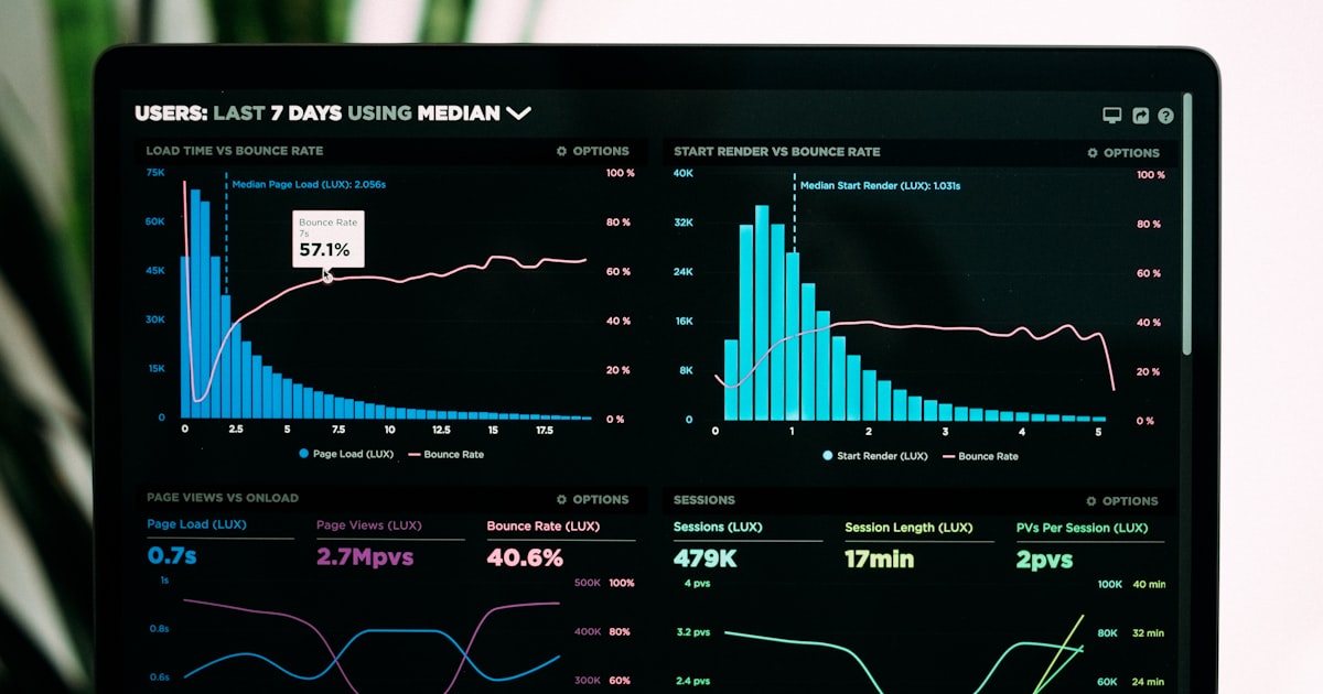
Website Speed Optimization: Why Your Site Is Slow and How to Fix It
A practical guide to diagnosing and fixing website performance issues that hurt your search rankings and conversion rates.

Restaurant Website Design in Toronto: What Actually Converts in 2026
What Toronto restaurants need from their website to convert visitors into diners. Online ordering, reservations, mobile design, and common mistakes to avoid.

Small Business Website Checklist: 15 Must-Haves for 2026
The definitive small business website checklist for 2026 covering design, performance, SEO, security, and conversion essentials every site needs.
Grow your business with Web Design
Ready to put these web design strategies into action? Let Fieldgates handle it for you.